Wednesday, November 29, 2006

Bela Lugosi's still dead


Oh dear. More than two weeks have passed since the last posting. That’s very slack. And it’s not as if the images haven’t been arriving in TFP’s inbox. Far from it. It's swamped and deluged. It's gridlocked, bottlenecked and logjammed. Things are badly backed up. It’s time to brace and purge. It’s time to squeeze one out.

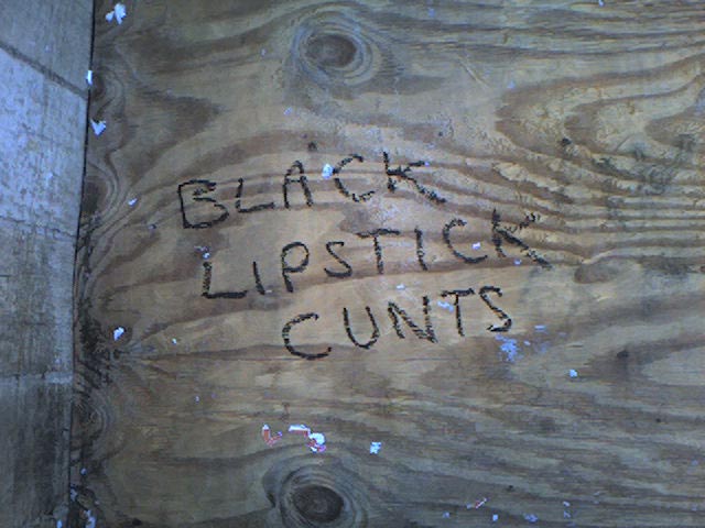
When it comes to making a satisfying splash, it’s hard to beat the above image. It was photographed by Filthy Pen correspondent Scott McCartney in September 2006 in a dead-end alley bordering a building site in Edinburgh's Cowgate. Just think, if he hadn’t ventured down there, this insult is likely to have gone unseen and unappreciated. Thank heavens for small mercies, and thank the council for the woeful paucity of public toilets.

Although the author was probably thinking specifically of the Scottish capital’s sizeable goth contingent when penning it, this piece of sloganeering is equally applicable to all followers of gothic ideology and fashion, wherever they may be. They're manifold and legion, and they're also loathed and ridiculed. For more than a quarter of a century, goths have maintained their position as the Millwall fans of alternative lifestyles - no-one likes them, they don’t care. And don't doubt that staying power. They'll see off the rise and rise of emo yet.

The depth of dislike that rages against goths is summed up nicely by the bile present in this scrawl. It's unambiguous in its condemnation. It's even written in black lipstick for added impact. Let's hope it was shoplifted from an alt.clothing store, or is that too much to ask?

Let's hear it for the goths, still taking a metaphorical pummelling after all this time, and let's hear it for the scribbler of the message featured in this posting's image. Nice work.

Monday, November 13, 2006

Size matters

If there’s one thing that irks the British, it’s being asked to change. We don't like change. We never have and we never will. Our dislike of change will not change.

Consider our money. Twelve of our fellow EU members had no qualms about giving up their individual currencies and adopting the euro, while we stick with the Queen's own sterling.

Then there are our weights and measures. We cling white-knuckled to the British Imperial System instead of fully embracing metrication. Look how firmly we cling. Look how white our knuckles are. Our road signs display distances in miles, not fancy foreign kilometres, and hardcore market traders have been prosecuted for flogging us bruised fruit and amusingly misshapen vegetables only in pounds and ounces. Not using metric scales when weighing them out for sale is a clear violation of the Units of Measurement Regulations 1995. Honestly.

And what about our pubs and bars? There, pints are still pulled, not bigger, frothier Euro-friendly litres as served elsewhere. In an age when binge drinking is our most popular leisure pursuit, slurping away on hefty megamugs of continental-style foamy lagerbrü would make perfect sense. Why? Because litres are bigger than pints, and bigger helpings equals less time wasted queuing for refills equals more time for drinking.

For nearly 40 years, British schoolchildren have been taught the metric system in class, only to be bombarded by imperial units when they venture into the real world. Are they left bewildered and befuddled by these double standards? Of course they are, and this posting's image offers some proof of that confusion.

Studio 24 is an Edinburgh club that regularly hosts under-18 events. Outside are several pieces of entertaining graffiti written by young punters as they queued to get frisked for blades and breath-checked for booze on the way in. Among the messages and insults scrawled as they killed time lies the entertaining effort seen above.

Though it's not drawn to scale, the author - we won’t call him Grant, as for all we know that name may have been added later in an attempt to steal someone else’s thunder - has included a measurement, to help viewers get a sense of proportion.

But this artwork is tainted by metric/imperial confusion. Partial inches should really be expressed as fractions, not by using decimal points. Trying to mix the two is just messy. If he wanted to use decimal points, he should’ve written 18.288 centimetres. Not only would this be mathematically accurate, it's also a more impressive number and would therefore appear bigger. Like an optical illusion.

There’s also a more serious problem though. The positioning of the arrows indicate that the scrotum has been included in the calculation. This represents a flagrant breach of accepted measuring etiquette. It’s cheating. Everybody knows nuts don’t count.

Purists might object, but The Filthy Pen is prepared to forgive and forget, because such mishaps and liberties are part and parcel of graffiti. Rules are made to be broken, and this piece breaks them in style. It might be a right cock and balls-up, but it's all the better for it.

Friday, November 10, 2006

Y Viva España

For this posting, we head where the sun always shines, the sangria is cheap, and the locals are friendly, although they don't seem to be very keen on donkeys. Grab your passport, we’re off to Spain.

Eagle-eyed Filthy Pen correspondent Colvin Cruickshank snapped the above image in Nerja, on the eastern tip of Costa del Sol in the province of Malaga, after noticing the slogan on a bottle bank while enjoying a winter break in España in October 2006. Spotter’s badge, Colvin.

Having recently showcased a vile slur against our Muslim friends (click here to take a look), it’s nice to be able to redress the balance with a more general though equally controversial claim. This one has the power to distress anyone who, regardless of their particular spiritual persuasion, believes in the idea of a single creator and/or ruler of the universe. But what does the author mean by it?

There are two choices. The first is that the writer may be using the phrase as an allegory in an attempt to initiate a wider debate about sexuality and the church. Gays in the clergy, arguments over same-sex marriages, American evangelical leaders renting male prostitutes, randy Fathers chasing choirboys round the vestry… could the author be making a collective reference to such controversies?

The alternative is that what you see is what you get, and that it’s a literal reference to the principal object of faith and worship in monotheistic religions. The culprit could simply be claiming that the deity is an iron.

That’s the thing about this piece - like the very concept of god, it can mean different things to different people.

Leaving behind its meaning for theologians, philosophers and art critics to bicker over, let’s consider it instead from a purely aesthetic point of view. The most striking thing about this graffitist’s work is the passion with which it has been executed. Look how thickly the paint has been applied. The excess has run down the recycling bin and resembles two bleeding wounds. If you believe in such things, you might think that what we have here is a documented case of bottle bank stigmata.

The Filthy Pen remains convinced that Britain leads the developed world in the creation and application of graffiti, but is happily prepared to acknowledge and demonstrate that Johnny Foreigner can daub a decent effort too. International submissions are therefore invited, and we warmly welcome this one – the first to arrive from continental Europe.

Of course, the fact it has been written in English may mean it was carried out by a British holidaymaker trying to stir up some trouble on their travels, and is not the work of a Spanish native at all. If it was a tourist, well done. It packs much more of a punch than just drunkenly flashing your arse to the Guardia Civil in the town square.

To whoever decorated this bottle bank, hola y gracias. Mi sombrero no está en mi cabeza, as they might say over there.

Wednesday, November 08, 2006

Word up

Like an inventive chef who creates their own clever variation on a long-established menu favourite, the miscreant responsible for the work featured in this posting serves up standard fare with a novel twist. And relish.

Penile graffiti is usually presented as a ham-fisted drawing or a cack-handed doodle. Here though, on a stone pillar outside Concrete Wardrobe, a swanky designer furniture outlet at the St Mary's Street end of Cowgate in Edinburgh, we get a generous helping of originality courtesy of a phantom scribbler. Rather than the crude hieroglyphic or preposterously proportioned diagram that we've come to know and love, the perpetrator takes us by surprise by rustling up a written offering instead. Cheeky.

Admire the confident strokes of the lettering, and pay homage to that wholly superfluous exclamation mark. It's the graffitist's equivalent of painting a fluorescent arrow to point at an already obvious neon sign. Pure bravado.

Flicking a stiff two fingers to convention, this one really stands out. The use of red ink helps. It seems to be quite a popular colour among street artists. There’s a lot of it about.

This image was snapped way back in September 2005, but nothing lasts forever. Everything is transitory. Before long, someone - most likely the shop-owner, perhaps having grown tired of being harangued about it by flustered customers and indignant passers-by - attacked the word with, well, let's indulge in some idle speculation here. Bleach and wire wool? Soapy water and a scrubbing brush? Cilit Bang and a J Cloth? Or just a vague feeling of sadness and some good old-fashioned elbow grease?

Whatever it was, it certainly did the trick. Today, only a faint trace of it remains, though it can still just about be made out, as you can see for yourself by looking here. It’s a shame, isn’t? At least the original bold effort lives on in its full glory in this posting though.

The cock is dead. Long live the cock.

Monday, November 06, 2006

Got2 get a mssg 2u

The English language is a remarkable thing. It’s in a state of permanent flux, forever changing and developing. New words and phrases come along all the time to reflect the trends and inventions of modern life and popular culture. Earwitness. Muffin top. Snoutcast. Celebutard. Songlifting. Dirt pill. They may stick around and enter common usage, or they might hover for a while before falling out of favour and dropping out of sight. It’s linguistic evolution innit.

One of the most revolutionary of all recent changes has come about through the mobile phone Short Message Service phenomenon. It has led to the adoption of a whole new lexicon of abbreviations which make it possible to squeeze long missives into the 160 character per message limit that SMS imposes. Dropping vowels and skipping punctuation, using single letters instead of doubles, utilising numbers, symbols and phonetic acronyms to replace either all or part of a word – these are just some of the tools that can be used by txtrs + they wrk a fckn trt. Evry1s tkn 2 it like dux 2 wtr.

Today’s image, which appears on a wall at the Grassmarket end of Edinburgh’s Cowgate, just across the road from Subway nightclub, shows how enterprising scribblers can cleverly combine the old with the new. The author of this example, Rab, has taken one of the longest-running forms of graffiti, where the writer marks the wall with their name or initials followed by the words ‘was here’, and has merged it seamlessly with a postscript that owes a debt to txt mssgs.

Unfortunately, Rab seems to have become a little confused mid-message, and our angry young man has got himself into a bit of a pickle. Judging by his jagged handwriting, he seems to have written it in an almighty hurry. In his rush to complete the job, Rab has shown a startling lack of consistency between the use of upper and lower case lettering, and he has also penned ‘ur’ instead of ‘yr’. Both of these add personal touches to his work, but the second point also results in shorthand that can easily be misread as ‘up you are arse’, instead of ‘up your arse’, which was surely his intended message to the world. Oh dear.

Never mind Rab, it’s the thought that counts. And we know exactly what you mean.

Wednesday, November 01, 2006

Come outside and say that

It’s half past three on a Saturday night Sunday morning in modern Britain. A lot of luridly-coloured drink has been taken. The night has been a good-humoured one, but suddenly, on the way home, an invisible line is crossed. A drunken, throwaway comment gets taken the wrong way.

First there’s a retort, then a response, then a counter-retort. A small argument develops. It escalates into a row. Next stop, a full-scale slanging match and the airing of long-standing grievances. Then a push, a shove, a poorly-thrown punch. Now there’s a scuffle, part-wrestle, part-fistfight. Soundtracked by their fellow revellers’ calls of “Leave it”, “He ain’t worth it” and “Do him”, it inevitably peters out without a clear-cut winner - one dishevelled protagonist sports a bloody nose, the other a split lip. Both face long walks home, punctuated by occasional noisy vomiting.

Tomorrow’s hangovers will pass, of course, but the bad feeling will linger on. It won’t go away, and now there’s a feud. This leads to a schism. Friendships are broken, people take sides, loyalties are divided. Next thing you know, you’re drunk again, and now you’re chalking up lies and obscenities about the object of your hatred on a wall. Well, we’ve all been there haven’t we?

Petty personal insults writ large for all to see. Ain’t they lovely? Take today’s example, spotted in late October 2006 towards the bottom of Waverley Steps, on the wall of the old Scotsman building, close to the Market Street entrance of Edinburgh’s Waverley Station.

It’s the little touches that make all the difference. They can elevate a piece of crude graffiti and transform it into a quality insult. With this one it’s the use of the general collective COCK in preference to the plural and slightly more personal COCKS that really makes it count. It suggests that Arjun, whoever he might be, is of particularly loose moral stature. It infers that he'll suck any old non-specific cock, and that makes the insult all the more cutting.

It’s a low blow. It’s below the belt. That’s got to make your eyes water.