Art is a four-letter word
 If you’re planning to write something in a public place, you’ll want to make sure that it stands out from the myriad of saucy slogans and audacious doodles that already decorate the nation's walls. What you need is the graffitist’s version of a USP – a unique selling point – something that will make an impact and get your efforts noticed. You need to be inspired in order to be seen.
The authors of the examples found in today’s images share a similar approach. Though their works are many miles apart, what links them is the way they’ve gone about executing their brief messages.
Each of today's graffitists has opted to write a single Anglo-Saxon expletive, and to liven up their chosen word by labouring over its style. And what flourishes they’ve applied. Embellished with artful curves and loops, the opportunities to air their creative bents have not been wasted. They may only have had four letters to work with, but they’ve all managed to create mini masterpieces out of their limited resources.
The first image, which can seen at the top of this posting, was submitted by Filthy Pen correspondent Nicola Rainey. Nicola was bowled over when she spotted it on a bus stop shelter while walking along Edinburgh’s Broughton Road in October 2006. The letter f is particularly impressive, with its sweeping tail that loops back on itself, and the artist has chosen to carry out their work using a eye-catching shade of blue-green ink for added effect. Smashing stuff there. Thanks Nicola.
And now, in a similar vein, an alternative take on the same word:
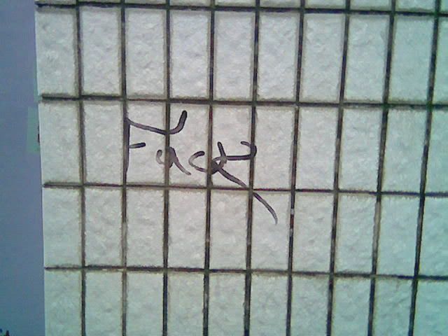
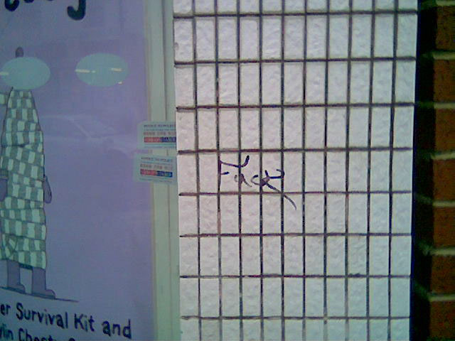 This example was found written on the tiled wall outside the Cleethorpes branch of Boots in December 2006. It’s almost 300 miles from the version of the word discovered by Nicola, yet the two pieces have much in common. Here, the emphasis has been put on the bold, sweeping k, which is delivered with aplomb, although that capital F is quite fancy too, isn’t it? And the writer has picked a great site - an otherwise undecorated wall belonging to one of Britain's best-known chain of shops. Cheeky. For a closer inspection of their splendid penwork, click here.
Finally, a little bonus in the form of a second foul-mouthed favourite. Here it is, in all its glory:
 This image was taken by Filthy Pen correspondent Chris Growcott, and has been sitting patiently in TFP’s formidable photo archive waiting to be utilised ever since he submitted it. Like Nicola’s image, this was also taken in October 2006. Chris came across it on the steps leading up to the bus stop on the Western Approach, by Telfer subway, close to Fountainpark in Edinburgh.
With the stylised strokes used to compose its capitals, there’s a distinct East Asian flavour to this one, with hints of Japanese and Chinese calligraphy. Lovely. And for using such a base insult to deface the tiresome tag sprayed by an earlier artist, let’s give the author some bonus Brownie points.
And there we are. Three separate images in a single posting. What a bonanza.
posted by the filthy penpusher at 2:13 pm
![]()
![]()

0 Comments:
Post a Comment
<< Home